 Cute Little Things: ‘Totoro’s Sublime’
published in Mole: Cute Little Things
Jinhee Park, John Hong, authors
Even as adults, we have long admired Miyazaki Hayao’s animated character ‘Totoro’ from the movie My Neighbor Totoro (1988) because of the way the character portrayed a new definition of cuteness: instead of the infantilization first coined by ethnologist Konrad Lorenz in the 1940’s, Totoro inverts the physiology and psychology of the term cute as baby-like and in need of parental care, through a character that is sublime, larger-than-life, and able to give care. At one instance Totoro is fuzzy, huggable, and innocent, and at another, teeth-baring, omnipotent, and wise. It is this unpredictability, the nurturing pleasantness vs. the destructive sublime of nature itself, that Totoro embodies.

In terms of embodiment, Totoro is volumic but on the contrary infinitely light and able to balance and fly away on a spinning top – a cuteness that is visceral, earthbound but at the same time fleeting. We detect a certain Totoro-ness for instance in Anish Kapoor’s Cloud-Gate in its massive belly-like form that seems like it is light enough to levitate. Its adorable bean-like figure from a distance grows into an immersive reflectivity at close range, turning the city into a distorted panopto-panorama and the public around you into an alternate universe of neotenous beings.
Ever since Totoro, creating a quality that transcends scale by flickering between the haptic and the abstract has been one of our pervasive obsessions. Although the idea has existed in our work since the beginning of our practice (SsD is a shortening of the cute ‘Single Speed Design’ named after our one-speed bikes), our first direct forays into the topic were our Infinite Box pavilion for the 2010 Gwangju Biennale in Korea and our Miniature Living ‘tower’ in Portland, Oregon. The former is our attempt to defy and confound the assumption that size and space are inextricably related, while the latter decouples function and space.
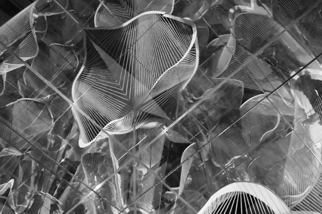
The Infinite Box is both a compact and resolutely finite (2m x 2m x 2m) cube and a virtual, dimensionless space. In this way we conceived of it simultaneously as furniture, building, and an infinite landscape. From the exterior the discreteness of the volume is obviously apparent except for the fact that fragments of voids are subtracted out of its corners which are then spanned with cilia-like fluorescent cables. These lines with their associated voids become like fuzzy thresholds or funny mouths. The goal was to imbue in the audience a desire to touch the object, interact with it as if it were alive: a primitive form of communication. Like a harp, the fluorescent lines can be played so that it ‘gives back’ experience to the user.

All of this is to attract audiences to first approach and interact, then to peer inside, and finally to enter – the inside is paradoxically an infinitely expanding space formed by mirrors on all sides. The voids which were incomplete fragments from the exterior are reflected and now conceptually inverted into complete figures. The rigid volume of the exterior is left behind for an infinitely expanding field with hints of a distant horizon. The interior and the exterior are not completely separate experiences however – the ‘work’ of passing through the threshold is like a reverse birth (or perhaps what a marsupial might feel when entering its mother’s pouch). The impenetrable concept of the infinite is made somehow understandable by being packaged within the defined compactness of the exterior. The infinite is paradoxically a hidden space, a child’s clubhouse, a shelter for unlimited imagination. And while it expands without limits, it is a concept that can almost be held in the palm of the hand.

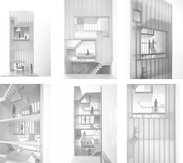
In our Miniature Living project, we likewise tap into cuteness through ambiguity of scale. With a 16’x16’ overall footprint, the three story house (as interpreted through the building code) is actually a mini-tower with eight floors. Our project manifesto reads, ‘Curate your life with miniature living!’ Like a full-scale dollhouse, the goal of occupying minimal space while enjoying maximum programmatic functionality becomes possible through the users’ curation of activities, objects, and spatial relations.
Instead of literal floors, there are only ascending and descending horizontal surfaces specific to the metrics of the body. Unlike a ‘regular’ house where eating, sleeping, bathing, working, etc., are expressed by ‘named’ single-function rooms, programs are defined by the datums they occupy. Uncoupling space from function allows multiple and fluid uses.
We likened the daily ritual of Miniature Living to a musical score where the horizontal lines become the useable surfaces and the notes become the human figure nimbly scaling up and down the staff. Like the Infinite Box, architecture becomes an interactive structure that is not just occupied but ‘played.’ The liberation of slipping away from the naming conventions of living room, dining room, bed room etc. allows us to make a cute little semantic slip of dropping the suffix ‘room’ and only using the active ‘ing’ verb. Therefore surfaces of dining, living, sleeping, loving, exercising, etc., can also include activities that are usually considered outside of the domestic, such as working, making, conferencing, commuting and so forth. Following this line of thought, we also dropped ‘House’ from the project name in favor of the action verb ‘Living’. Paradoxically, imploding the literal scale of the residence to its performative surfaces has expanded its use to include the city at large.

Also, in the same way interiority is abstracted in the Infinite Box, the skin of Miniature Living is made of translucent polycarbonate with no areas of clear glazing resulting in a diffusely daylit inside. A kind of Platonic allegory is referenced where the real becomes conceptual: the assumed measurability of space through a hard chiaroscuro of shadows is replaced by soft, subtle gradation and transition. If one wants to connect with the outside, operable panels open completely so that there is no mediation of glass or envelope. Instead of windows being tethered to rooms, a vivisection similar to one found in a dollhouse reveals a spectrum of volumes and activities.
If Miniature Living is a plaything, its spatial ‘lego’s are based on the 8’ module of readily available construction materials. Beginning from the double bay of a 16’x16’ footprint, 8-foot 2x4s and 4×8 sheets of plywood and polycarbonate become the building’s main components. The act of modularity is intentionally reified and reiterated to allow the occupants to understand the building as not something that mysteriously appeared out of a set of architectural plans, but something that is a ready-made to be constructed and reconstructed easily. The scales of the doll-house, the furniture, the house, and the city all become accessible through the ubiquity of construction materials and assemblies.

While the previous projects are both conceptual and literal, they are also meant to be experienced as psychological spaces in a ‘Being John Malkovich’ kind of way. Either for individuals or a small group (Infinite Box’s hall of mirrors) or as a twist on the single family type (Miniature Living’s singular mini-tower), they borrow from the art and artifice of omphaloskepsis (naval gazing!) to make a self-reflexive point. In this way they are for us and their intended audiences akin to teaching and learning machines – in other words they are cute toys.
The stakes become much higher with our Songpa Micro-Housing project as it is an application of the concepts to a building with multiple, simultaneous users. The 17 micro-units are in fact like a collection of infinite boxes but instead of the interiors being made of literal mirrors they are lined with analogical ones. Surfaces at an arms-reach fold out to support a myriad of uses and programmatic zones. The operability of the ‘furniture’ is more akin to a mechanistic extension of the body rather than literal tables and shelves. And similar to Miniature Living where we argue for all the conveniences of a large dwelling compressed into a small footprint, the interior of each Songpa unit can be folded out to imbue a single room with multiple identities such as kitchen, living, bedroom, office, garden, etc.
Where the agency of a social collective enters is in the idea of what we are calling ‘Tapioca Space.’ Like the ambiguous gel around a tapioca pearl, zoning regulations are leveraged so that leftover semi-private zones occur between each apartment. Instead of an apartment’s walls being the hard interface between private and public, tapioca spaces are performatively stretchable areas, a fuzzy boundary between one’s unit and the other occupants. While clerestory windows and other strategic openings borrow light and views, literally shared zones in the form of eating areas, gardens, places to wash your dog, or even the blank wall of your neighbor’s unit to project one’s images, expand the individual units. As each individual unit is a module, it is specifically sited within a spatial matrix to have different qualities of introversion and extroversion via its relationship with its surrounding tapioca.

However, pre-fabrication is more the method not the rule. Unlike the overall figure of boxes seen in the Nagakin Capsule Housing, our tapioca space is meant to transmit the individuality of each apartment ‘box’. Where the massing of Nagakin obeys the core, Songpa dances around it, shifting in differing directions in a negotiation that seems to never resolve. The result and major difference between the strategies is that the exterior of each Songpa apartment is accessible through a terrace where in Nagakin the capsules are completely encapsulated cantilevered objects with no access to the exterior.
Although subtle, this conceptual shift is momentous in creating units that are more cute – now accessible, their exteriors can be lovingly adorned. Like Totoro, they can also be understood as larger than life entities that provide surrounding and protecting enclosure. To bring definition to the ambiguous tapioca space, an outer skin of the building lightly traces the given zoning envelope with a system of vertical and diagonal lines reminiscent of the fine grain cilia of the Infinite Box. The linear pipes densify to create railings, thicken to create drains, span vertically to provide scaffolding for vines, and like its neighboring buildings, form barriers on lower floors to dissuade petty thieves.

The goal of cuteness in our work is not to create pet-architecture or baby-spaces. Our version is more aligned with a new interpretation of nature. Not nature in its naturalized and domesticated state but in its state of unpredictability – both its gentle and destructive sides. As we see in Totoro and in the next generation animation where we are transported into microscopic and/or macroscopic realms, transformed into pets or giants – size and its relationship to hierarchy and value has to be all but abandoned. Cuteness instead can be a literal and conceptual state that rebuilds and re-creates our relationships between ourselves and others, while expanding our limited understanding of the cosmos. Its project is less about exerting explicit control or parental care, and more about forming ‘contingencies and ironies’ in a Rortian sense, that compel us to rethink the immediately assumed. In the end cuteness is about a dynamic reciprocation between architecture and ourselves, even if metaphorically created, that inspires us to be creative.
RELATED WORKS:
 |
 |
 |
 |
 |
| cloud | sponge park | infinite box | convergent flux | songpa micro-housing |
